Preview – New Sidebar Header for DayBack

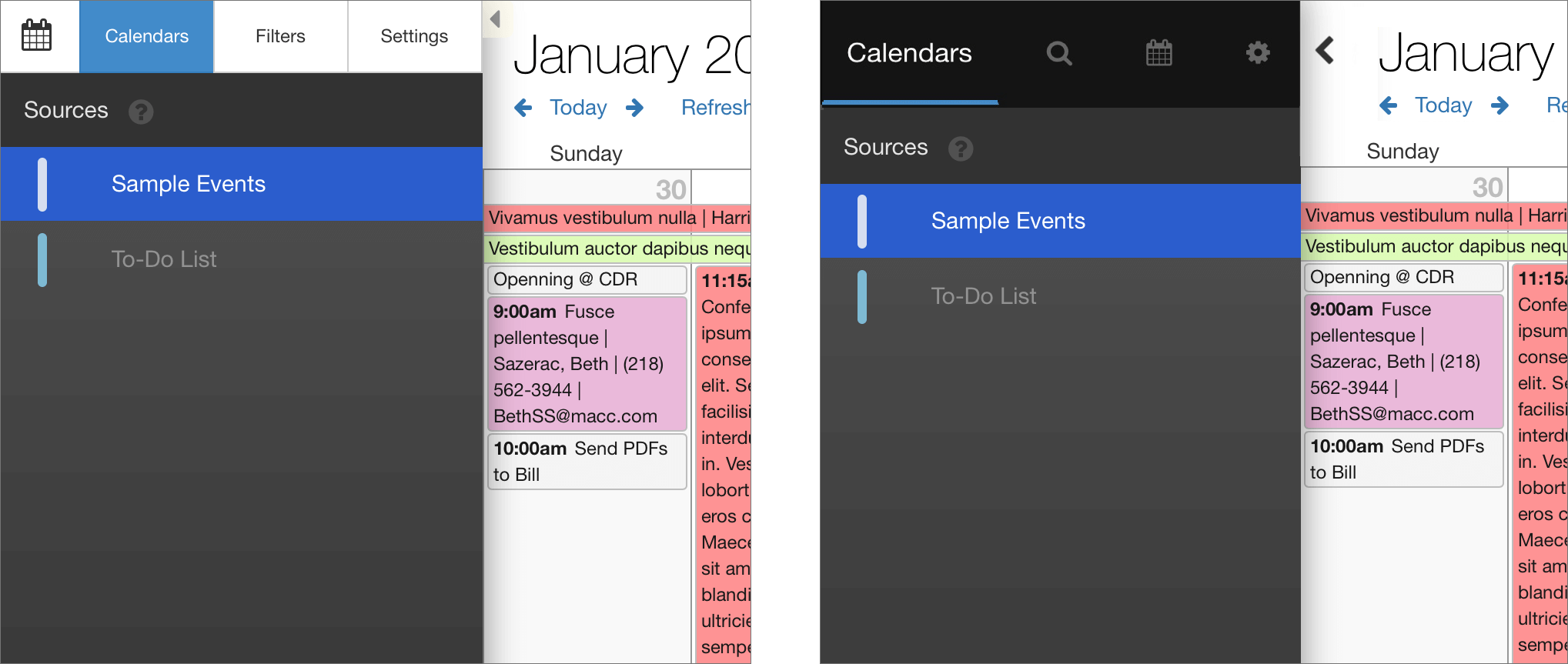
We’re about to launch a new in-app update to DayBack that will include a new look for the sidebar header. This new version is much easier to modify with CSS for folks who want to remove tabs, rename tabs, or switch between icons and text for the tab labels. We also think it makes it more obvious that users can close and open the sidebar.

If you’re already using DayBack and don’t like the new look, you’ll find notes and CSS below that will let you revert to the old style. This preview and the instructions below are for you.

Here’s what the new header will look like. The current version is on the left, and the new version is on the right:

Getting the New Sidebar Look

The new sidebar will be available as an in-app update in the next day or so.

Changing Back to the Old Version

If you’d like to revert to the old style, add the CSS below to DayBack and you should be all set. If you haven’t edited DayBack’s CSS before, you’ll find detailed instructions here: Editing Calendar Themes.

.sidebar .tabPanel {
	top: 48px;
}
.sidebar .tabButtonContainer {
	background: transparent;
}
.tabButtonContainer .is-filtered:before {
	content: "";
	position: absolute;
	top: auto;
	bottom: 4px;
	right: 10px;
	left: 10px;
	height: 3px;
	background-color: #2b5dcd;
	width: auto;
	border: none;
	border-radius: 0;
	margin: 0;
	opacity: 1;
}
.sidebar .tabButtonContainer .btn {
	font-size: 12px;
	height: 48px;
	width: 88px;
	line-height: 18px;
	color: #333;
	background-color: #fff;
	border-color: #ccc;
	border-top: transparent;
	border-bottom: transparent;
}
.sidebar .tabButtonContainer .btn:after {
	display: none;
}
.sidebar .tabButtonContainer .btn:hover {
	color: #333;
	background-color: #e6e6e6;
	border-color: #adadad;
}
.sidebar .tabButtonContainer .btn.selected {
	color: #fff;
	background-color: #428bca;
	border-color: #357ebd;
}
.sidebar .tabButtonContainer .btn.mini-calendars{
	font-size: 20px;
	width: 57px;
}
.sidebar .tabButtonContainer .btn.filters i {
	font-family: inherit;
}
.sidebar .tabButtonContainer .btn.filters i:before {
	content: "Filters";
}
.sidebar .tabButtonContainer .btn.settings i {
	font-family: inherit;
}
.sidebar .tabButtonContainer .btn.settings i:before {
	content: "Settings";
}

A few more notes for existing users who want to keep the old style:

• If you removed tabs using your own CSS, those tabs should stay gone in the new version as the class names are the same. You likely changed the widths of the remaining tabs to get things to look right, and that’s likely not necessary now: try removing those width changes once you’ve updated to the new sidebar.

• If you made your own styling changes, you can likely recreate those using a combination of the CSS above and the changes you already made. Please let us know if you get stuck.

• The new sidebar puts a blue circle around the filters icon (the magnifying glass) when you have filters applied. We found that users would sometimes forget that they’d applied a filter and then wondered why some events weren’t showing up. This should help.

• DayBack Online is getting a similar sidebar refresh, so if you’re using shares and don’t want to use the new sidebar in your shares, you can use the same CSS above to revert DayBack Online. Notes for changing the online CSS are here.

Featured Posts

Follow Along

Stay up to date with the latest news & examples from SeedCode

7 Comments

  • Mattina

    Looks great! Could you please share, where to change the background and the indicator color in the CSS? Thanks.

    • seedcode

      Give this a try, Mattina:

      .sidebar .tabButtonContainer, .sidebar .tabButtonContainer .btn{
      background: red;
      border-color: red;
      color: blue;
      }
      .sidebar .tabButtonContainer .btn:hover {
      background-color: #e33f42;
      border-color: #e33f42;
      }
      .tabButtonContainer .btn-primary {
      color: white !important;
      }
      .tabButtonContainer .btn-primary:after {
      background-color: green;
      }

      • Mattina

        Whoohooo! Great, thanks.

    • seedcode

      Thanks for the kind words, Mattina! Here’s how you can change the background (first) and then the highlight color. Let me know if I misunderstood what you mean by “indicator color”.

      .tab-panel-content {
      background: red;
      }
      .dbk_listSelectButton.dbk_selected {
      background: green;
      }

      For folks new to editing DayBack’s CSS, you’ll find instructions here: https://www.seedcode.com/pmwiki/index.php?n=DayBackForFileMaker.EditingThemes

      • Mattina

        Hi John, thanks for the ultrafast reply (and sorry that I didn’t check it earlier 😉 I rather meant the header with the buttons for calendar, search-calendar-settings buttons and the blue indicator, showing which of the buttons I clicked.

  • Eric

    Love the progress here! Does this mean there is a redesign to the mini-calendars coming soon too?

    • seedcode

      Thanks, Eric! Hadn’t planned on tackling those mini calendars, though I would like to make some changes there (like showing the calendars date range so you can see the week/range you’re viewing a get it’s context inside those three months). Is there something specific you’d like to see us change in those mini-calendars?

Leave a Reply

Your email address will not be published. Required fields are marked *

Check out some of our other posts ...

New Week Views in DayBack for FileMaker

You can now expand DayBack’s week views to show two or three weeks at a time. We’ve been using this internally in beta mode for a few weeks, and it’s very helpful to see what’s coming up next week while navigating this week’s work. Find tips on how to work with these new views on the DayBack blog.

To-Do Lists in FileMaker – New in DayBack Calendar

Now create and manage FileMaker to-do lists directly from the Unscheduled Items sidebar in DayBack Calendar. Our latest extension brings to-do behavior to any FileMaker table. Like unscheduled items, this behavior is based on a new checkbox field in your table, so some or all of your records in the table can be treated as to-dos. Mark your to-do’s done as you complete them, or drag them into the calendar to schedule time to work on them. See it in action here: Customize Your To-Do Lists This extension was designed to be pretty a scaffold onto which you could build your own, more specific to-do behaviors by customizing the action itself or the FileMaker scripts tha manipulate events. Here are some ideas to get you started. Add To-Do Lists to Your FileMaker Calendar If you haven’t already enabled the unscheduled sidebar along DayBack’s right edge, you can learn how to turn that on here: unscheduled items in DayBack. Then, download the custom action and learn how to configure it here: To-Do Lists in DayBack Calendar.

Improved Resource Selection

We’ve made some big changes to how you filter and assign resources when editing events in DayBack. These changes will make it much easier to work with large numbers of resources, especially for folks assigning multiple resources to the same event. Watch a video of the new behaviors and learn more here: Adding Multiple Resources to an Item. If you haven’t looked at your resource field mapping in a while, here is how you set that up: Mapping the Resource Field in FileMaker. Please get in touch if you have any questions about this; we’re here to help.

Suggesting Appointment Slots

Show Available Slots that Match Multiple Criteria Schedulers often look for gaps in their schedules to find the open resources for each opportunity. But sometimes, gaps don’t tell the whole story. You may have invisible criteria like skill-matching, cleaning requirements, or multiple resources to schedule at once. Or you may be on the phone with an opportunity and must suggest available times as quickly as possible. In these cases, DayBack can suggest the best slots that match all of your requirements. Scheduling Criteria Are Often Invisible In the movie above, schedulers can see openings for the two technicians, but they can’t easily see if the required rooms and equipment are free at the same time. While DayBack can show different types of resources simultaneously, as the number of criteria increases, it can be hard for schedulers to see everything at once and still make good decisions. Our customers often have rules that constrain when an otherwise open slot can be scheduled. Here are some of the invisible criteria we’ve built out for customers: Because DayBack is highly scriptable, it can scrub open slots against a variety of criteria to render just the slots that fit all your requirements. When multiple slots match, DayBack can even rank them so you can present the most ideal slots to your clients first. You Have to *See* Slots in Context to Make the Best Decisions Many scheduling apps present possible appointments as a list of dates and times. Without showing more information about each slot, schedulers can book days too tightly, always suggest the same providers first, or create huge gaps in some provider’s schedules. Ranking slots can help, but we’ve found that highlighting ideal slots alongside existing appointments gives schedulers the information they need to make the best decisions. We’ve seen schedulers quickly offer to split appointments or to slightly change services when they see available slots in the context of other appointments, trainings, vacations, and breaks. Getting Started We customize the recommendation of slots for each deployment as part of DayBack’s implementation packages. Please get in touch if you think DayBack could make a big impact on your team.

COMPANY

FOLLOW ALONG

Stay up to date with the latest news & examples from SeedCode

© 2024 SeedCode, Inc.